
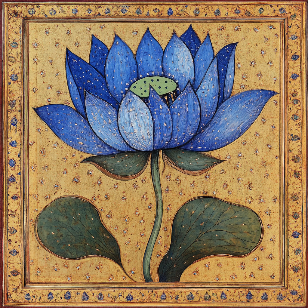
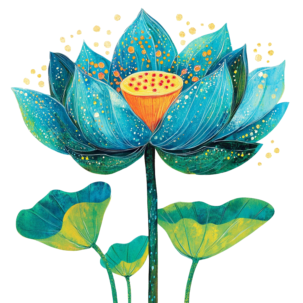
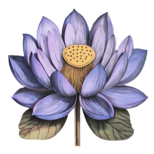
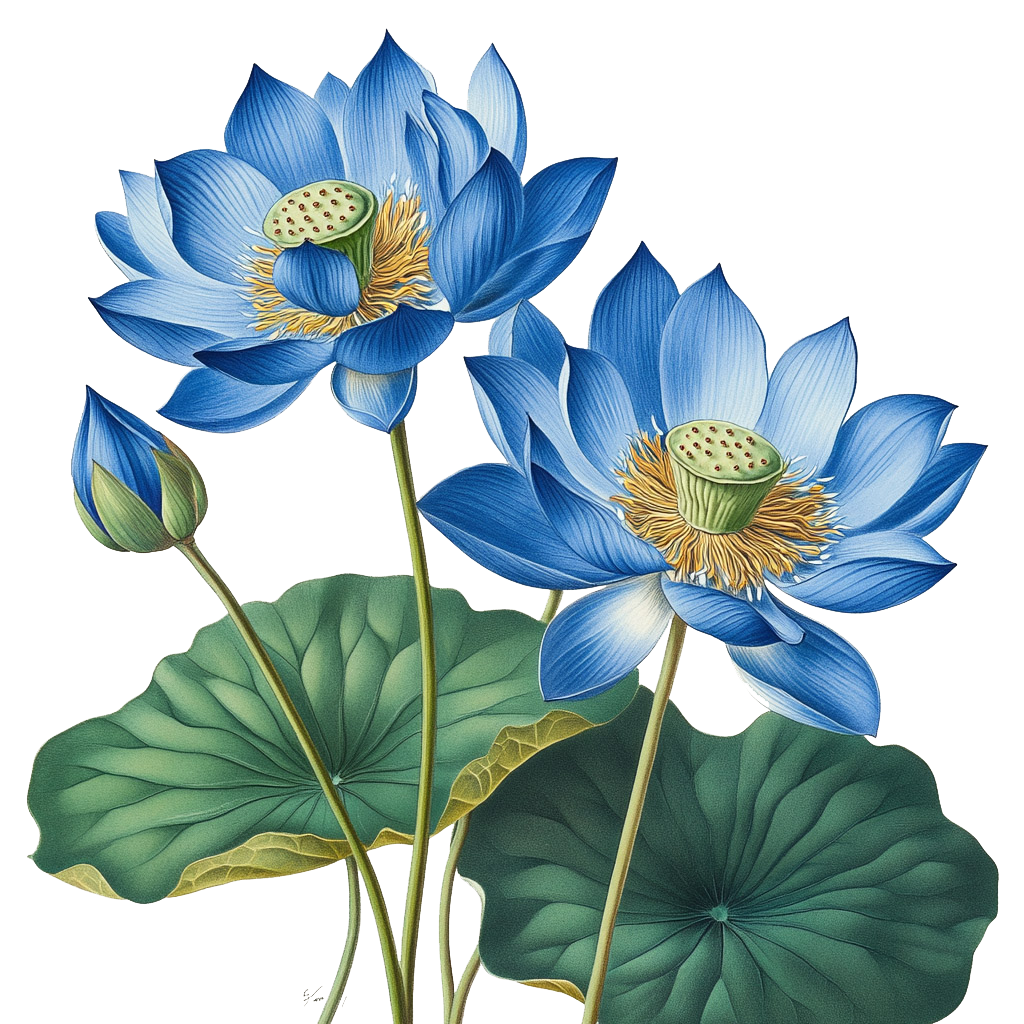
Blue Lotus
In an era where corporations are trying to present as humans and humans are trying to present as corporations, the direction is to stay true to the human phenomena of dreams.
Color Palette

The first iteration of color is quite predictable for what the audience may think of dreams. Blues and purple hues have a nebulous, cerebral feel. Blue denotes trust, reliability, and wisdom while purple is mysterious, imaginative, creative and spiritual. The tan color is softer, more warm and comforting than a stark white. The black is softer to match the color of closed eye lids.
Typefaces

Headings
Custom loaded font with decorative line work and serifs. Serif fonts convey sophistication, formality, professionalism, reliability and class. The thin decorative lines completing and accentuating certain letters and adding a bit of whimsy to the classic elegance of the serif font.
Paragraphs
For more lengthy reads and subtexts a san serif font is employed for versatility, legibility, and approachability. San serif are more modern and balance the characteristics of serif font used for headings.
Logos
SAMPLES


Wordmark using brand font. Modern lotus iconography.


Wordmark using brand font with different font for “Dreamwork,” gentle as as a dream. Modern lotus outline iconography.

Something with a little more whimsy in B and L with a bit of unorthodoxy with letters in “Dreamwork.”

An aqueous vibe, with psychedelic wobble.

An aqueous vibe, with psychedelic wobble.
Theme_01
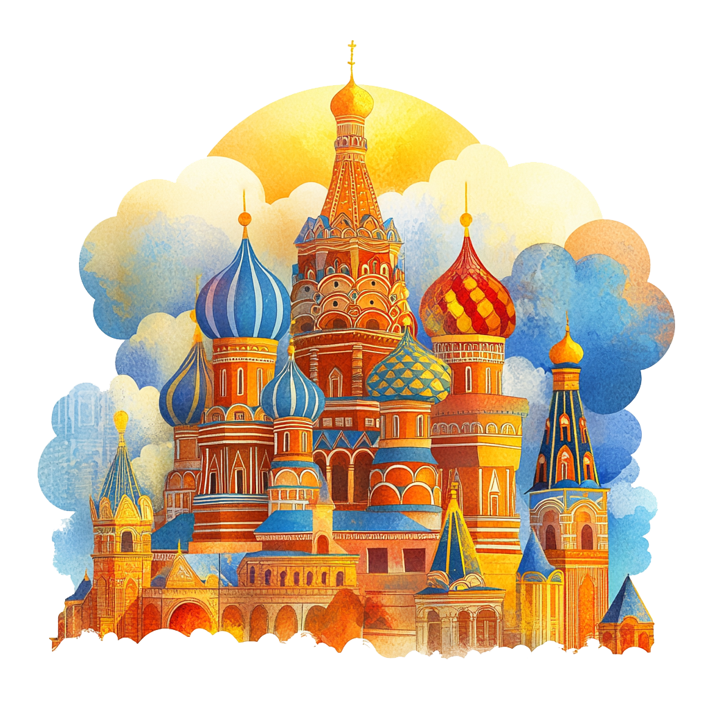
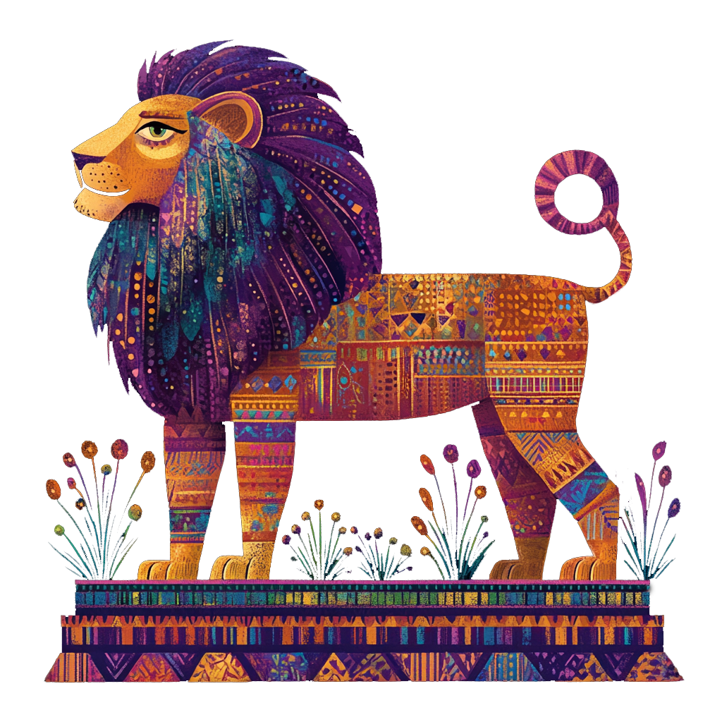
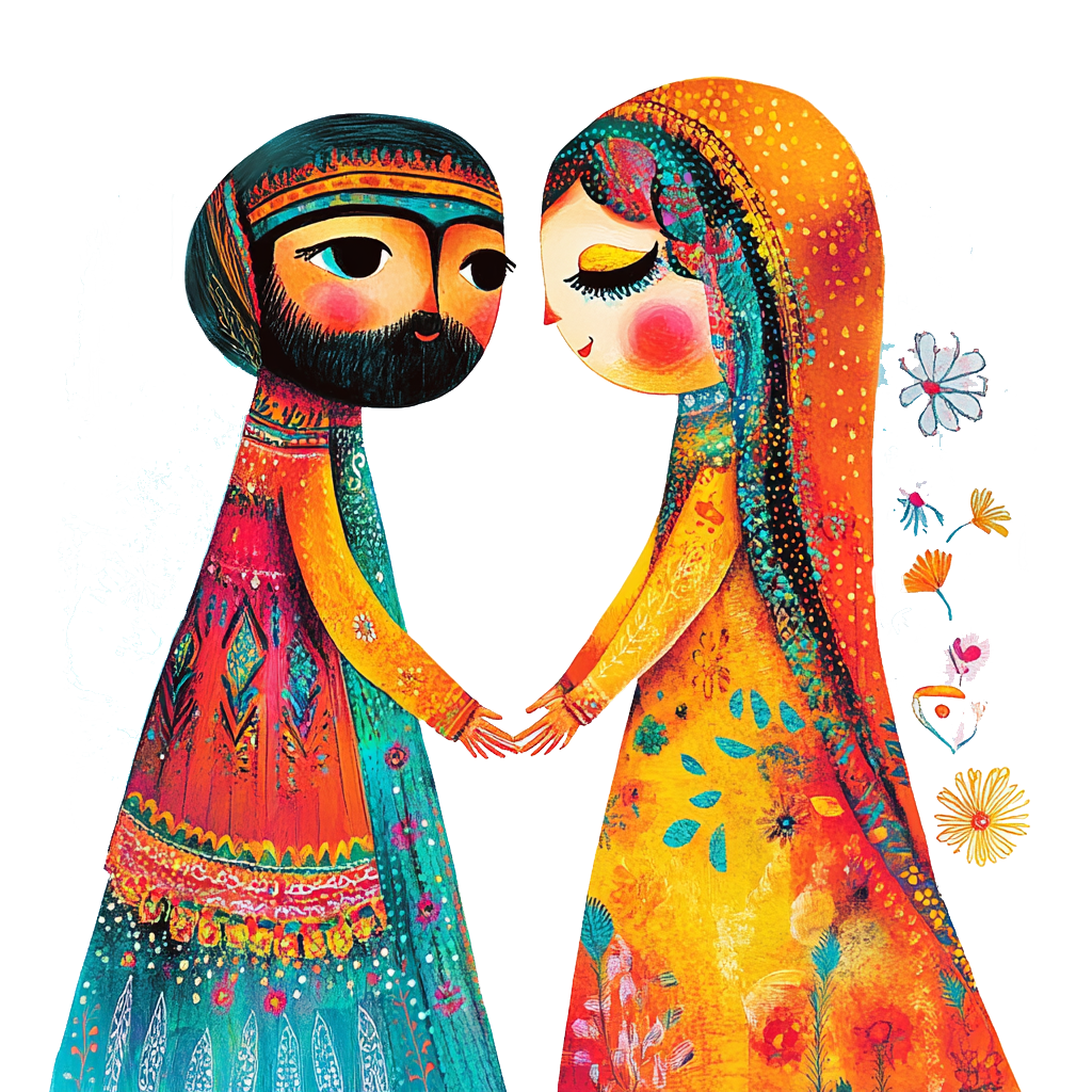
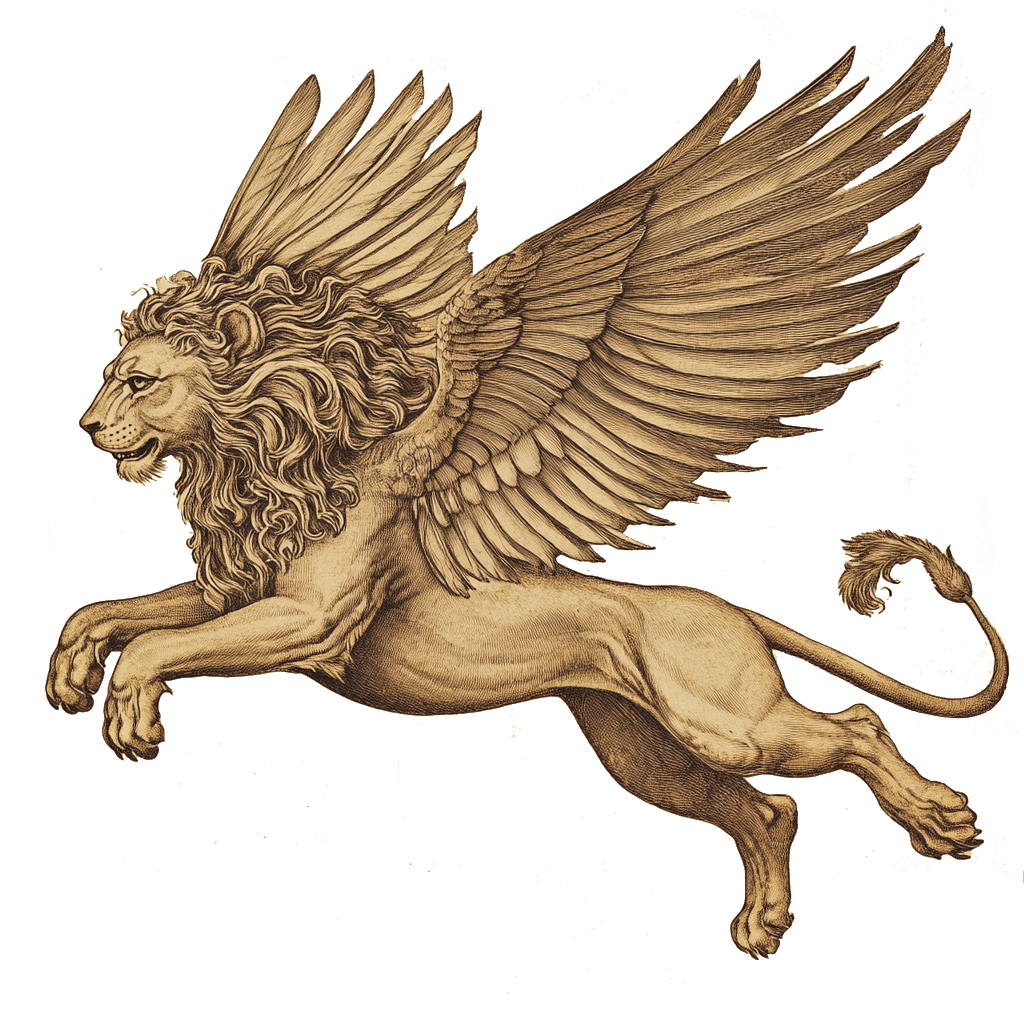
EASTERN
This is the more mythical Indian style full of color. Elements of connection, bravery, conquest, royalty/wealth, and delicateness are expressed in the images.
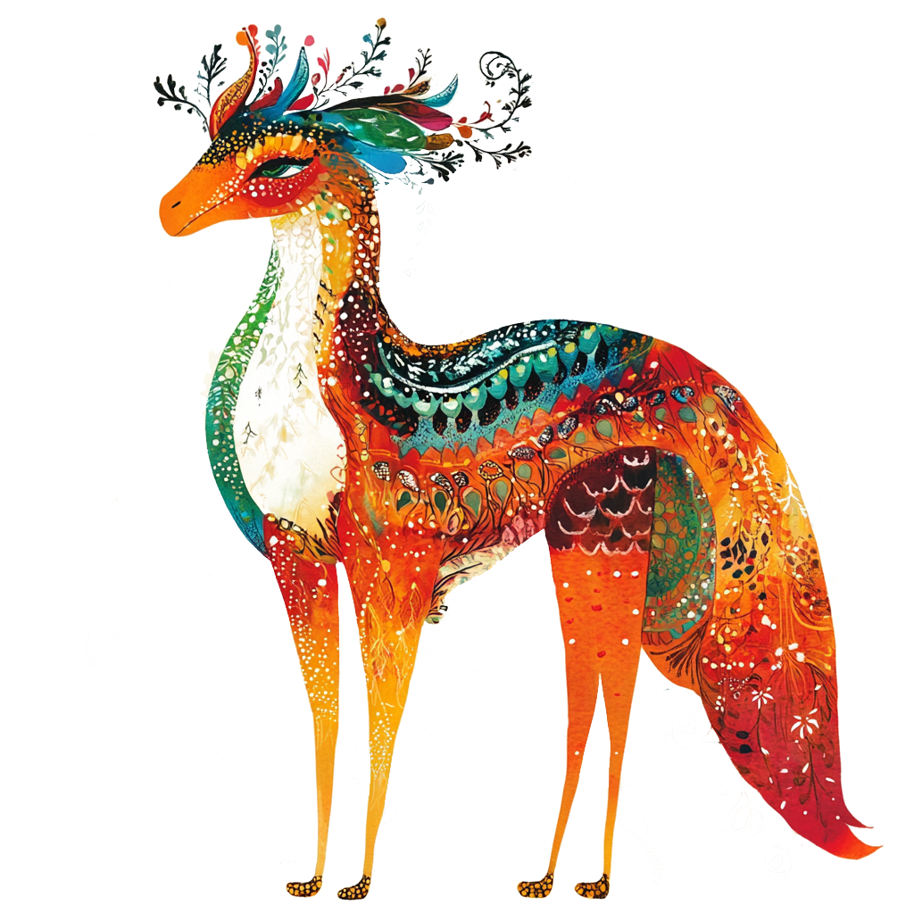
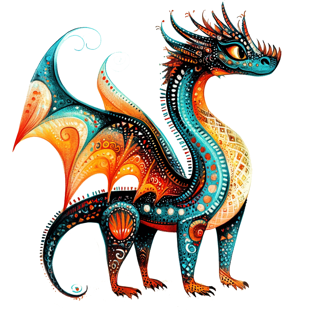
Theme_02
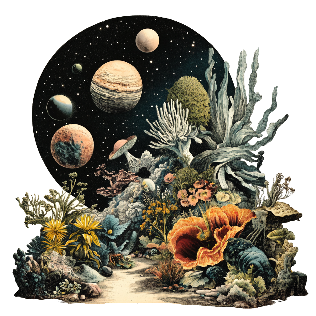
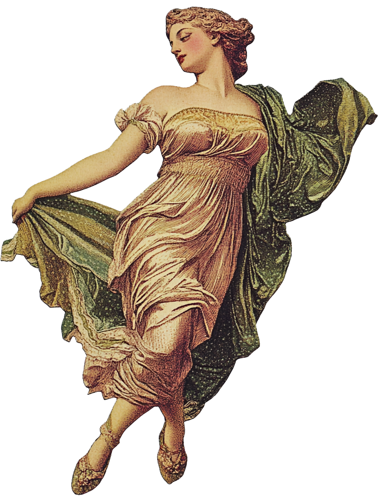
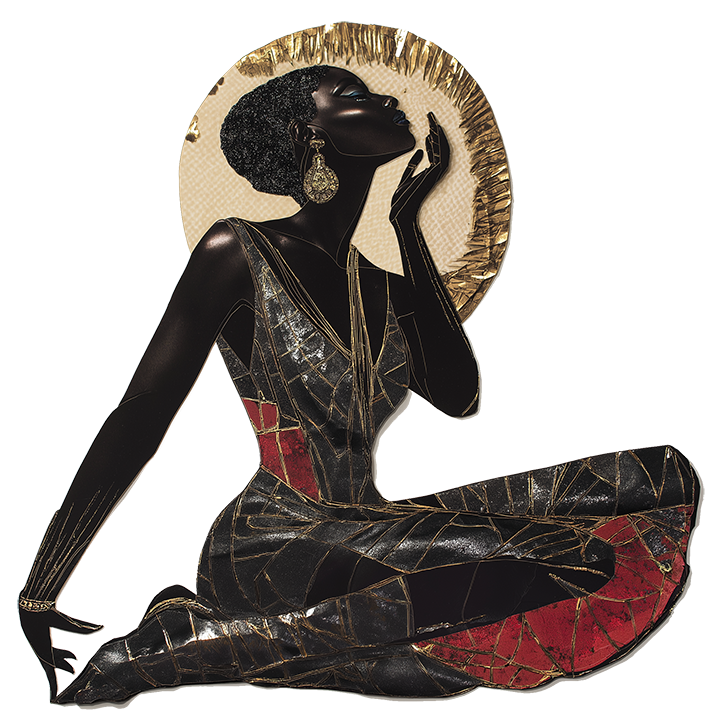
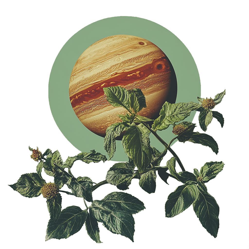
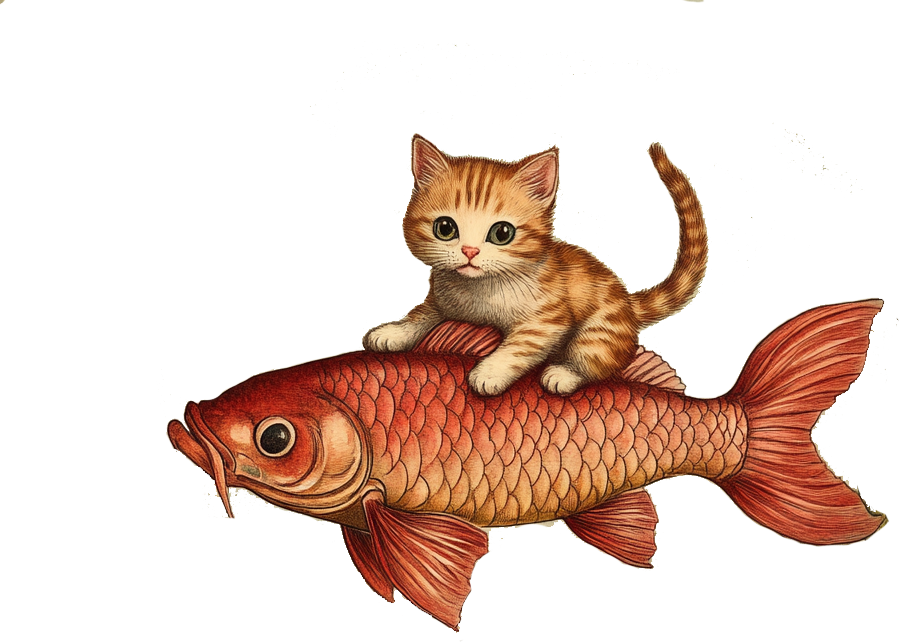

COLLAGE CHAOS?
Illustrations that feel out of a dream with disconnected themes and characters whose styles don’t necessarily match but complement each other. Motion on certain assets gives them life.
Theme_03
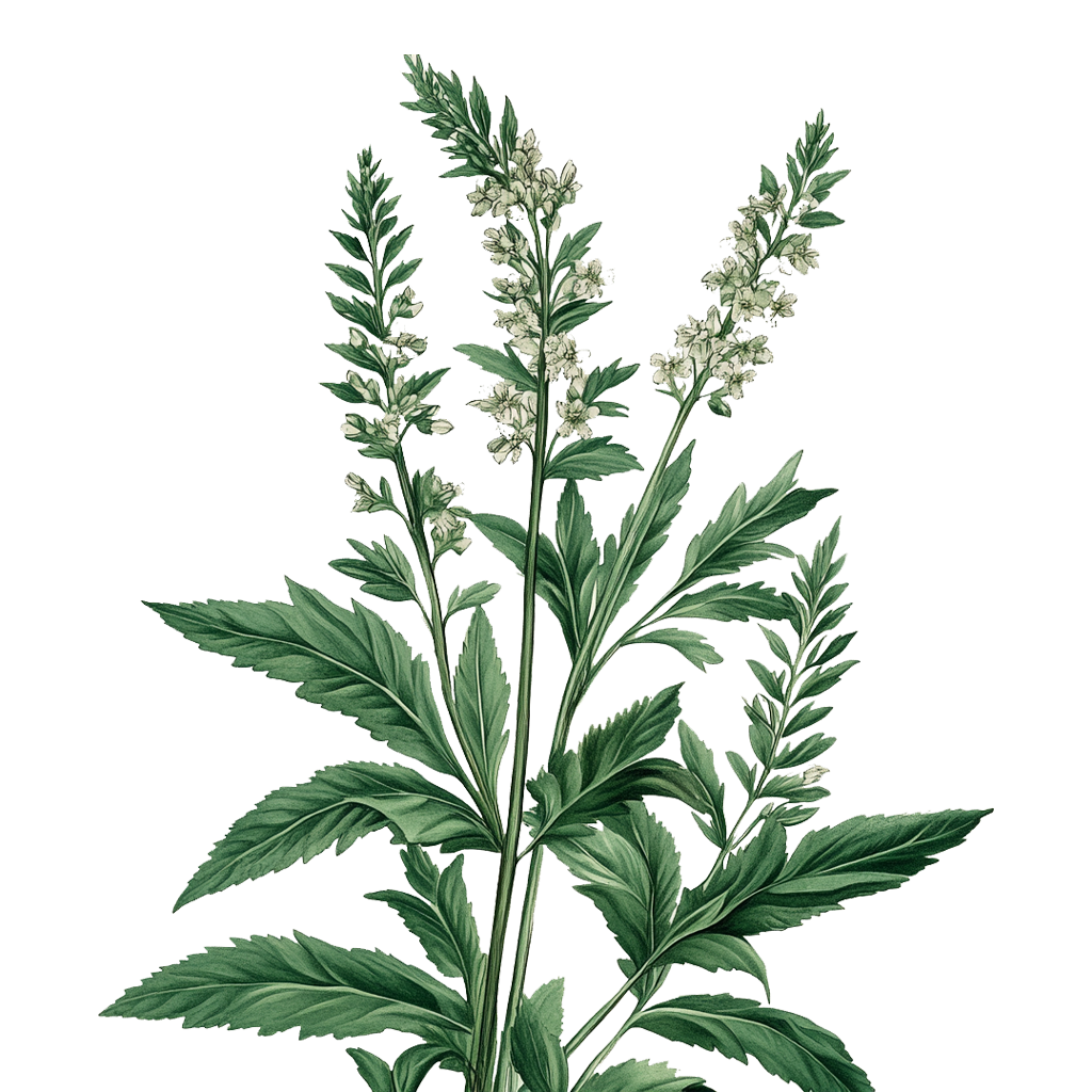
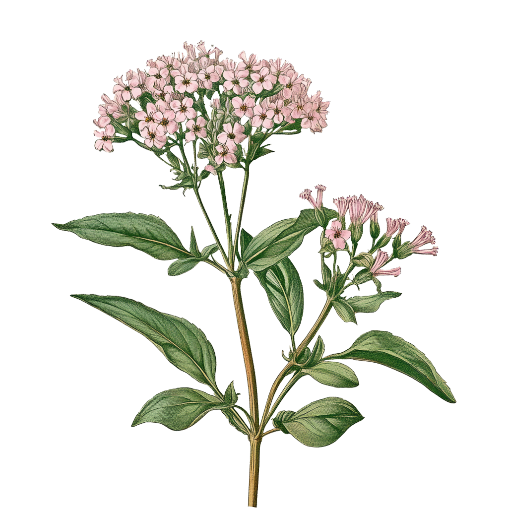
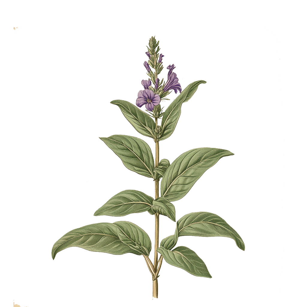
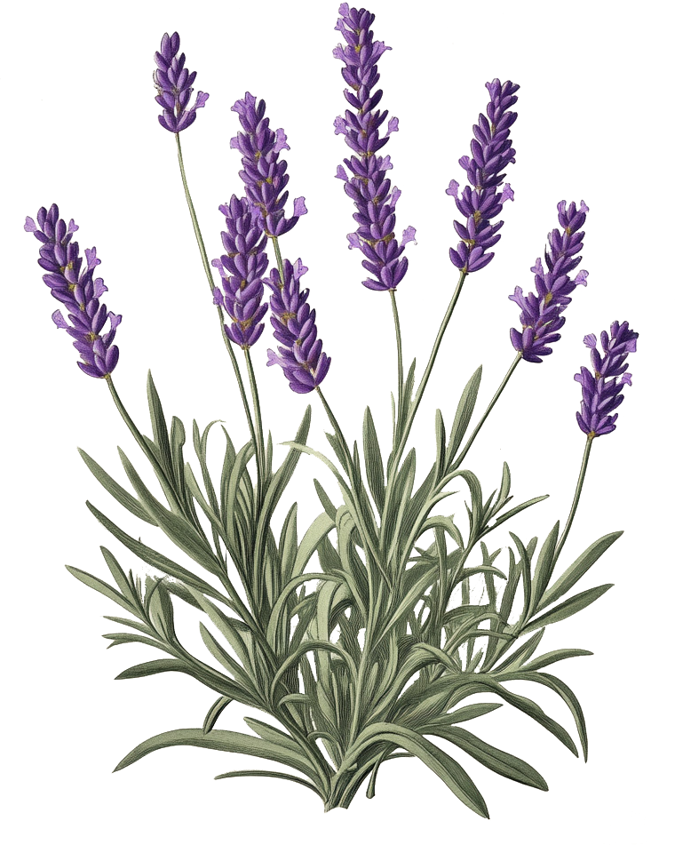
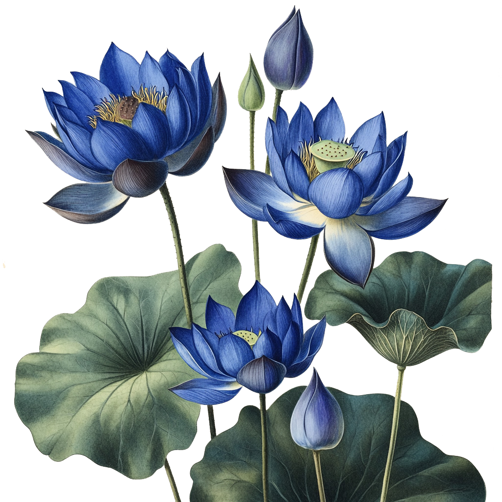
PLANTAE
Classic botanical illustrations of dream and sleep related plants for more tangible, earthy expression that accentuates plant medicine offerings.